Introduction
Imagine entering a store where every section is mislabeled, the signs are written in a language you don’t understand, and the staff are unable to answer even basic questions. That’s how a blind person can feel when navigating an inaccessible website.
In today’s digital-first world, ensuring your website is accessible is far more than a courtesy—it’s a fundamental necessity. According to the World Health Organization, at least 2.2 billion people have a near or distance vision impairment, with at least 1 billion of these cases involving vision impairment that could have been prevented or has yet to be addressed. By designing with accessibility in mind, you’re not only adhering to compliance standards but also fostering inclusivity, reaching a broader audience, and building meaningful trust with your users.
Why It’s Important to Build an Accessible Website for the Blind
- Legal responsibility: Laws such as the Rights of Persons with Disabilities (RPwD) Act in India, the Americans with Disabilities Act (ADA) in the U.S., and global standards like the Web Content Accessibility Guidelines (WCAG) mandate accessibility. Companies that fail to comply risk lawsuits, fines, and reputational damage. Thousands of ADA website accessibility lawsuits are filed annually in the U.S., demonstrating how seriously accessibility compliance is being enforced globally.
- Business benefit: Making your site accessible expands your potential customer base. For instance, if your e-commerce store isn’t screen-reader friendly, you may be shutting out thousands of willing buyers.
- Better overall usability: Accessibility best practices—such as clear navigation, structured content, and descriptive labeling—improve the experience for all users, particularly those using mobile devices, voice search, or browsing in challenging conditions like bright sunlight.
- Ethical responsibility: At its core, accessibility is about equal opportunity and digital inclusion. The web should be a place where everyone has the same access to information, services, and experiences, regardless of their abilities.
Understanding How Blind Users Navigate the Web
Blind and visually impaired users interact with the internet in ways that may not be obvious to
sighted users. For example:
- Linear navigation: Unlike sighted users, who can scan a page visually, blind users often experience content line by line through a screen reader. If your content isn’t properly structured, it becomes a frustrating maze of disconnected information.
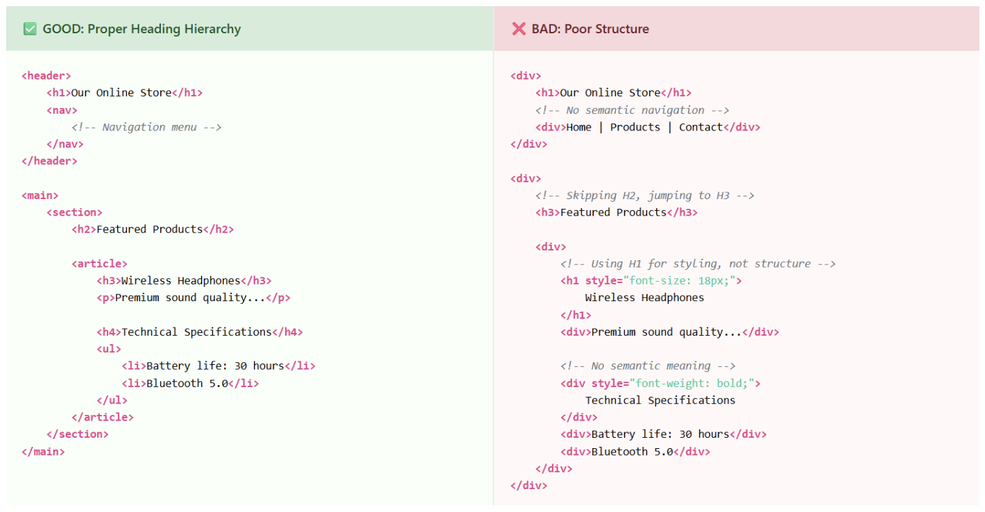
- Heading levels as a roadmap: Proper heading tags (<h1>, <h2>, <h3>) allow screen reader users to jump quickly between sections, creating a mental map of your content. When headings are misused for styling rather than structure, this navigation system breaks down entirely.
- Links and buttons: A button labeled only “Click here” tells a blind user nothing about what will happen next. However, “Download Product Guide” provides clarity and empowers users to make informed decisions.
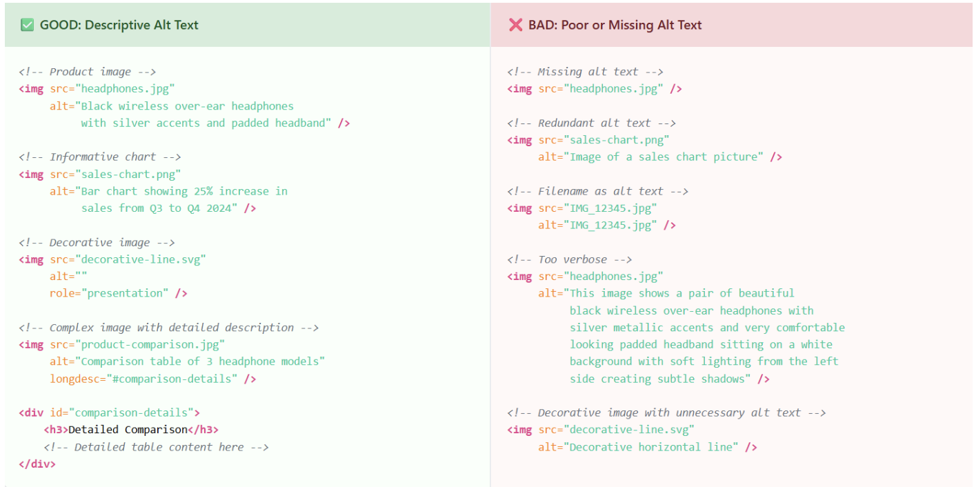
Real-World Example: Imagine a blind user visits an online clothing store. If product images lack alt text, the screen reader might announce “image123.jpg” instead of “Blue denim jacket, size medium, $59.99.” This forces users to rely on others for basic shopping tasks, eliminating their independence and potentially losing your sale.
Tools the Visually Impaired Use to Navigate Websites
Blind users rely on assistive technology to bridge the gap between web content and
accessibility. Some common tools include:
- Screen readers: JAWS and NVDA (Windows), VoiceOver (Mac and iOS), and TalkBack (Android). These programs read aloud page content, navigate menus, announce form fields, and even describe text formatting and page structure.
- Braille displays: Hardware devices that convert on-screen text into refreshable braille patterns, allowing users to “read” websites through touch. These are particularly useful for users who are deaf-blind or prefer tactile reading.
- Screen magnifiers: Software like ZoomText or built-in magnification tools used by individuals with low vision to enlarge text, images, and interface elements up to 16x their original size.
- Voice navigation software: Programs like Dragon NaturallySpeaking allow users to browse websites, fill forms, and click links using voice commands alone.
- Keyboard navigation: Many users rely entirely on keyboard shortcuts (Tab, Enter,Arrow keys) to navigate websites when mouse interaction isn’t feasible.
Developer Tip: You can experience your website from a blind user’s perspective by installing NVDA (free for Windows) or testing with VoiceOver on Mac. Close your eyes and try navigating your site using only these tools—you’ll quickly discover accessibility gaps you never noticed.
Key Steps to Ensure Your Website is Accessible for the Blind Community
Here’s a detailed breakdown with do’s and don’ts for each step:
1. Use Semantic HTML
- Do: Use headings in proper hierarchy (<h1> for main title, <h2> for major sections, <h3> for subsections).
- Don’t: Use headings solely for styling purposes (e.g., making text large and bold without semantic meaning) or skip heading levels
2. Add Meaningful Alt Text to Images
- Do: Write concise, descriptive alt text that conveys the image’s purpose (“Golden retriever puppy playing with a red ball in a park”).
- Don’t: Over-describe, add redundant phrases like “Image of…” or “Picture showing…” or leave alt text empty for informative images.
3. Provide Text Alternatives for Multimedia
- Add complete transcripts for audio content and podcasts.
- Include captions and audio descriptions for videos.
- Example: A cooking tutorial should describe not just the dialogue, but also visual actions
(e.g., “The chef dices onions into quarter-inch cubes using a sharp knife”).
4. Ensure Keyboard Navigation Works
- Users must be able to navigate through all interactive elements—menus, buttons, forms, and links—using Tab, Shift+Tab, Enter, and Arrow keys.
- Add visible focus indicators so users can clearly see which element is currently selected.
- Ensure no “keyboard traps” where users get stuck on elements.
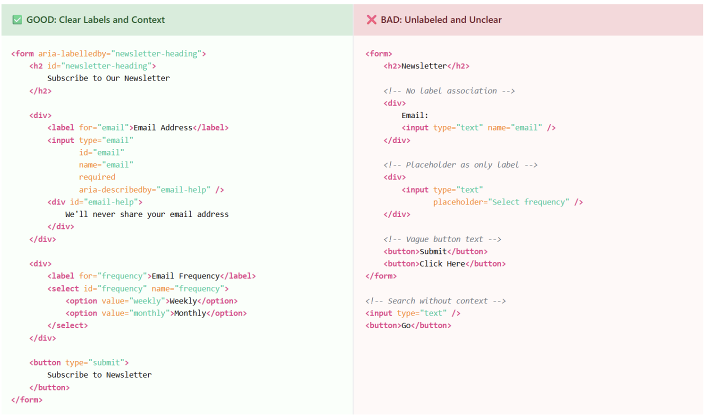
5. Label Forms and Buttons Clearly
- Do: Use descriptive, action-oriented labels (e.g., “Subscribe to Monthly Newsletter,” “Download PDF Guide”).
- Don’t: Use vague labels like “Submit,” “Click Here,” or “Learn More” without context.
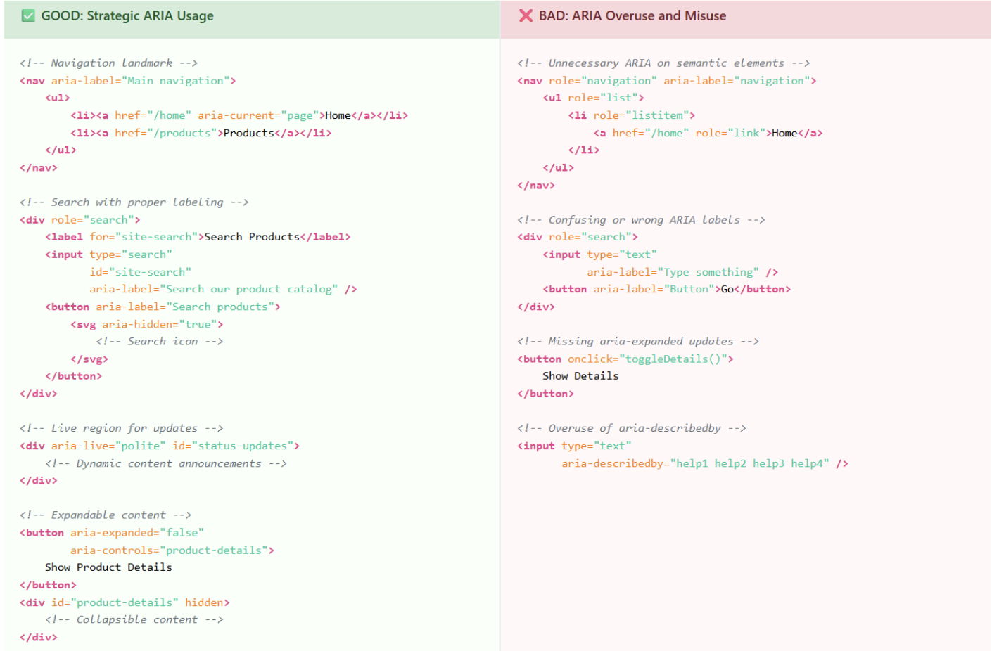
6. Implement ARIA Landmarks Wisely
- ARIA attributes (Accessible Rich Internet Applications) enhance meaning where standard HTML falls short.
- Example: aria-label=”Search products” on a search input, or aria-describedby=”password-help” for form instructions.
- Important: Overusing ARIA can confuse screen readers—always prefer semantic HTML when available.
7. Prioritize Contrast and Resizable Text
- Use contrast checkers (like WebAIM’s tool) to ensure text meets WCAG AA standards (4.5:1 ratio for normal text).
- Allow text resizing up to 200% without horizontal scrolling or layout breaking.
- Avoid using color alone to convey information.
8. Test with Screen Readers and Accessibility Tools
- Automated tools: WAVE, axe DevTools, Lighthouse accessibility audit (all free).
- Manual testing: Navigate your site using only a keyboard and screen readers like NVDA or VoiceOver.
- Real-user feedback: Involving actual blind users remains the gold standard for identifying issues automated tools miss.
Final Thoughts
Building an accessible website for the blind community isn’t just about avoiding lawsuits—it’s about creating a digital environment that welcomes everyone. Accessibility improves user experience, boosts SEO, expands your market reach, and builds lasting brand loyalty.
Think of accessibility as ongoing maintenance rather than a one-time fix. Technology evolves, user needs change, and new accessibility standards emerge. By continuously testing, updating, and actively listening to user feedback, you ensure that your website remains open, inclusive, and valuable for all visitors.
Remember: accessibility isn’t a burden—it’s an opportunity. When you design for users with disabilities, you create better experiences for everyone. Clean code, clear navigation, and thoughtful content structure benefit users across all abilities and devices.
Accessibility is simply good design—and good design works for everyone.
Sources and References
World Health Organization (WHO)
- Vision impairment and blindness fact sheet
- https://www.who.int/news-room/fact-sheets/detail/blindness-and-visual-impairment
ADA Lawsuit Statistics
- Seyfarth Shaw LLP ADA Title III Lawsuit Tracker
- https://www.adatitleiii.com/
Web Content Accessibility Guidelines (WCAG)
- WCAG 2.1 Guidelines – W3C Web Accessibility Initiative
- https://www.w3.org/WAI/WCAG21/quickref/
Americans with Disabilities Act (ADA)
- U.S. Department of Justice ADA Information
- https://www.ada.gov/
Free Accessibility Testing Tools
- axe DevTools by Deque Systems
- https://www.deque.com/axe/devtools/
- Google Lighthouse Accessibility Audit
- https://developers.google.com/web/tools/lighthouse
Screen Reader Software
- NVDA (NonVisual Desktop Access) – Free screen reader
- https://www.nvaccess.org/
- JAWS (Job Access With Speech) by Freedom Scientific
- https://www.freedomscientific.com/products/software/jaws/
Contrast Checker Tools
- Colour Contrast Analyser by TPGi
- https://www.tpgi.com/color-contrast-checker/
Akash Rawat is a Software Engineer at Valiance Solutions with expertise in full-stack development using React, Django, and cloud technologies. He has worked on AI-based platforms, GenAI chatbots, and large-scale web applications for clients across domains. Akash is passionate about building scalable, efficient solutions and holds multiple AWS and Google Cloud certifications.

